Angles, Shadows, and the Art of Making You Uncomfortable: Speed Grapher's Visual Playbook
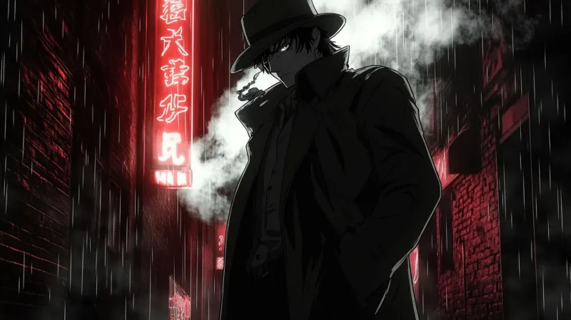
Photo: dramatic anime film noir dark cinematography shadows composition, via images-wixmp-ed30a86b8c4ca887773594c2.wixmp.com
There's a reason certain scenes from Speed Grapher stick with you long after the credits roll. It's not just the subject matter — plenty of anime go dark without leaving a mark. What Gonzo's production team understood, even if it wasn't always articulated publicly, is that how you show something matters as much as what you show. The series built its psychological impact one carefully constructed frame at a time, and revisiting those sequences reveals a visual grammar that was genuinely ahead of its time.
The Low Angle as a Power Statement
One of Speed Grapher's most consistent compositional tricks is the use of extreme low angles to establish dominance — but not in the way action anime typically deploys them. In most shonen-adjacent series, the low angle shot is a hype tool. It makes the hero look imposing before a big fight. Speed Grapher inverts this almost immediately.
When we first encounter the Tennozu Club's inner sanctum, the low angle isn't pointed at a hero. It's pointed at wealth itself — at architecture, at chandeliers, at people draped in expensive fabric who barely register that Tatsumi Saiga is in the room. The effect is suffocating rather than empowering. You're not meant to feel inspired by what you're looking up at. You're meant to feel small, trapped, and slightly sick about it.
This distinction matters because it recalibrates the viewer's relationship to visual authority. By the time an actual confrontation scene uses the same framing, your brain has already been conditioned to associate that angle with dread rather than excitement.
Color Temperature and the Two Worlds Problem
Speed Grapher operates in two distinct visual registers, and the color temperature shift between them is one of the show's most underappreciated technical achievements. Scenes set within the club and the upper echelons of Tokyo's corrupt elite run warm — amber, gold, deep red. On paper, those are luxurious colors. In context, they read like fever and rot.
Contrast that with the exterior Tokyo sequences, which push toward desaturated blues and grays. The city outside the club isn't glamorous, but it's real in a way the warm interior world isn't. Saiga's world — the war photographer living in a cramped apartment, chasing stories nobody wants published — exists in that cooler palette. It's unglamorous and honest.
The genius move is what happens when Kagura crosses between those worlds. Her color temperature shifts with her context, and the visual dissonance of watching her exist in the cold-toned outside world is part of what communicates her displacement. She's a warm-palette character trying to survive in a cool-palette reality, and the camera keeps reminding you of that mismatch.
Negative Space as Psychological Weight
Mainstream anime in the early 2000s was generally allergic to negative space. Frames were busy — detailed backgrounds, expressive characters, dynamic action lines filling every available inch. Speed Grapher goes the other direction in its most emotionally loaded moments.
There are conversations in this show where the speaking character occupies maybe a quarter of the frame, pushed to one edge, with nothing but empty space pressing in from the other side. It sounds like a budget-saving trick, and sometimes it probably was. But the effect is that the empty space becomes a character itself — it's the weight of what isn't being said, the threat that hasn't materialized yet, the loneliness that defines both leads.
One particularly effective sequence involves Kagura in a room she technically has access to but clearly doesn't belong in. The staging keeps her near doorways and edges, never centered, never settled. You could watch it with the sound off and understand everything you need to know about her relationship to that space.
The Camera-Within-the-Camera Problem
Saiga's photography creates a genuinely unusual visual challenge: how do you shoot a character who uses a camera as a weapon without the cinematography becoming self-referential to the point of distraction? Speed Grapher's solution is to rarely show us what Saiga sees through his viewfinder in a clean, unmediated way.
Instead, the show cuts around the photographic moment. We see the setup, we see the aftermath, and occasionally we get the flash — but the actual image is often withheld or distorted. This is a smart choice because it preserves the idea that the camera captures something we can't fully access. The photograph as a contained, finished truth versus the messy, ongoing reality the viewer inhabits.
When the show does break this rule and gives us a direct viewfinder perspective, it lands harder precisely because it's been withheld. You've been trained to expect the camera to look away, so when it doesn't, the impact is visceral.
Why This Still Holds Up
Streaming has made it easier than ever to pause, rewind, and really dig into visual choices that would have blown past most viewers watching on a television in 2005. Speed Grapher rewards that kind of attention in ways that a lot of its contemporaries don't, because the visual language wasn't decorative — it was load-bearing.
The story works differently if you strip away the compositional choices. The power dynamics feel less oppressive, the characters feel less isolated, the horror feels less inevitable. What Gonzo built here, whatever its other limitations, was a show where the camera itself had a point of view. And that's rarer than it should be.